
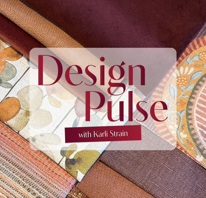
In this edition of the Design Pulse, I’m sharing an activity we had the pleasure of doing at High Point Market, the largest furniture market in the world. We were presented with four different color schemes and whichever one we were most drawn to was said to reflect our personality type. It was surprisingly accurate and incredibly interesting.
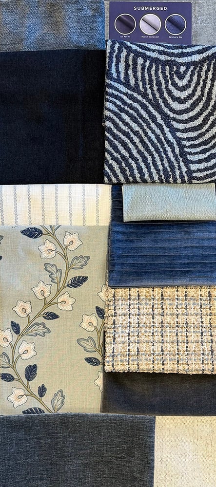
I’ve recreated those four-color schemes in the images I’m sharing, so take a look and choose one—or even two—that speak to you. Then see how closely they align with your personality.
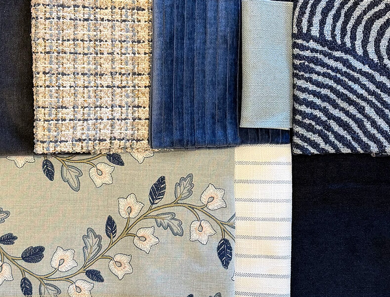
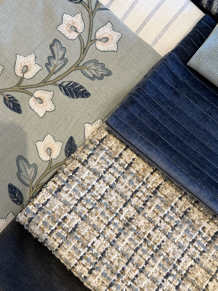
This color story features shades of blue, gray, and white. If you were drawn to this palette, the three words that best describe you are intuitive, observant, and calm.
Your natural state is submerged: calm on the surface, thoughtful and curious underneath. Observant, intuitive, and quietly analytical, you move with intention, taking it all in before you speak or act. With steady loyalty and an intriguing depth that draws people closer, your quiet confidence commands respect. You're drawn to this color story through its deep hues and subtle textures that evoke a sense of stillness and ease.
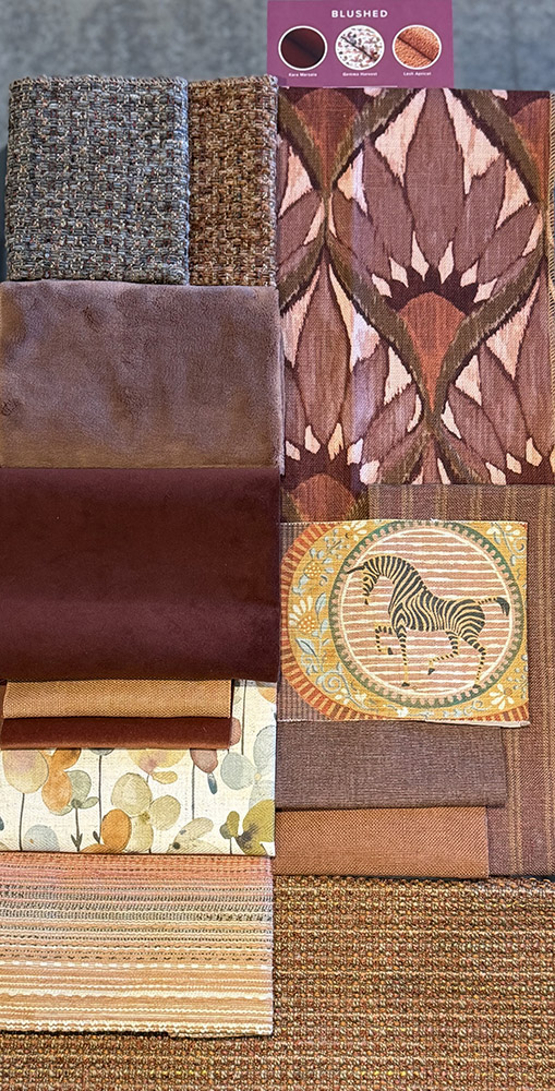
This palette features berry and blush tones paired with playful patterns. If this was your favorite, your three personality traits are bold, magnetic, and playful.
Subtle? Not your style. Your personality is blushed by bold choices, magnetic charisma, and a keen instinct for what’s next. You’ve never met a trend you didn’t want to try and you thrive on being the center of attention. Your vibrant energy and passion for celebration mean you know how to set a mood and keep it going. The blend of drama and playfulness in this color story calls your name with its rich jewel tones and luxurious textures.

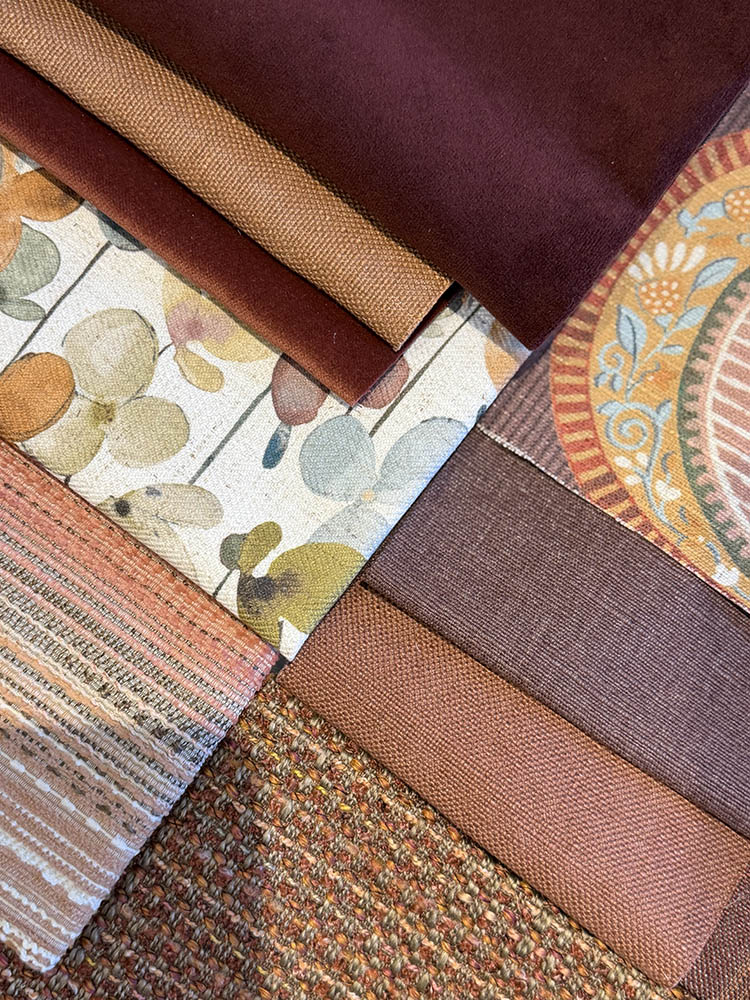
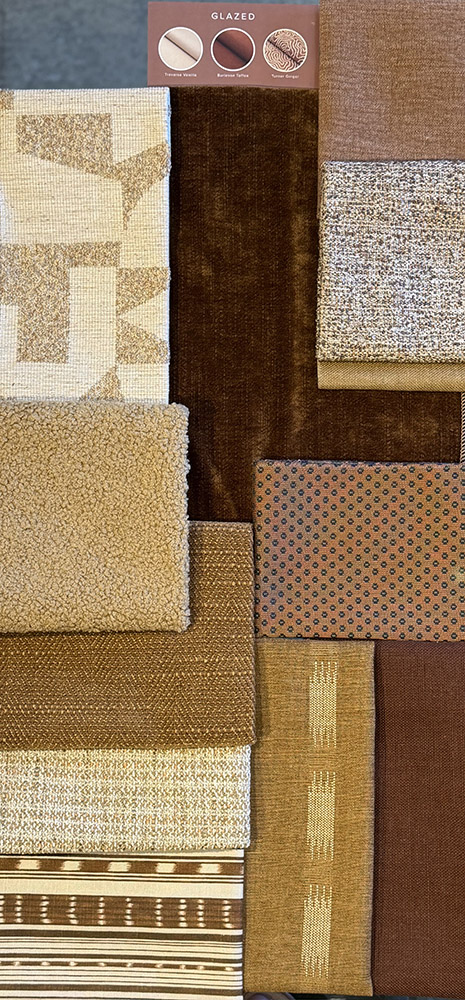
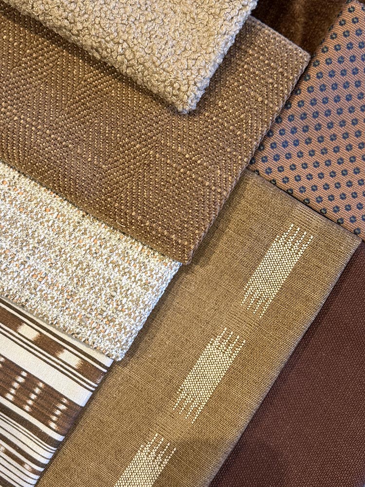
With terracotta, cream, and cinnamon hues accented by fun patterns, this palette reflects those who are warm, inviting, and effortless.
Warm without trying, cool without effort, and somehow everyone’s favorite person to talk to at a party, your aura is glazed. With a creative streak and a naturally inviting demeanor, people are drawn to your charm, wit, and the way you make connecting feel easy and enjoyable. This palette speaks your language through comforting neutrals paired with playful patterns, adding personality while maintaining a sophisticated feel.

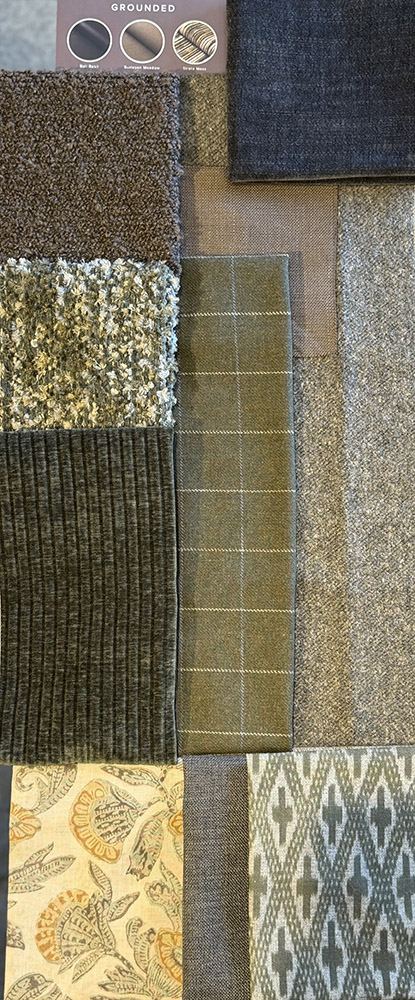
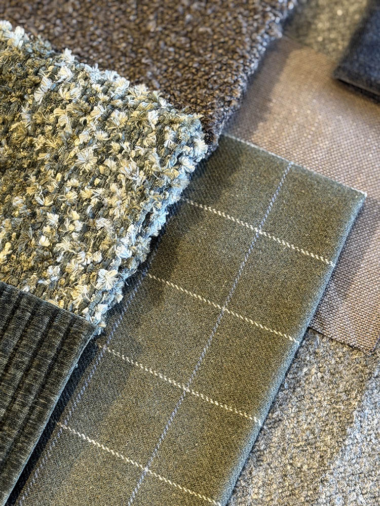
Featuring layered greens and warm, moody neutrals, grounded represents those who are balanced, natural, and confident.
You have a grounded energy that feels calm and confident without ever trying too hard. You find inspiration in nature and meaning in the details that others often overlook. You’re not one to chase trends. Instead, you choose what feels right. This self-assured approach brings balance to your relationships and everyday life. You're rooted in this color story, where layered greens bring the harmony of the outdoors inside.

I hope you enjoyed discovering what your color preferences might say about your personality. I found myself drawn to both Glazed and Grounded, and the combination felt remarkably accurate.
Don’t be afraid to choose more than one palette if multiple speak to you. Trust your instincts, compare notes with friends and family, and most importantly, have fun with it!
Yours in Design,
Karli

Every month, Karli dives into the world of design and shares her knowledge on the newest design trends in the "Design Pulse", in which she offers thoughtful insight on the trends that are shaping the design world today, and keeping an eye on what is coming next next! Click below to read more editions of Design Pulse!


Enjoy Savings, Events, Promotions, and Special Pricing delivered to you
"*" indicates required fields
No account yet?
Create an Account


